


This grade 8 scatter plots lesson explains scatter plots and association in one printable page, with definitions, a method and a worked example.
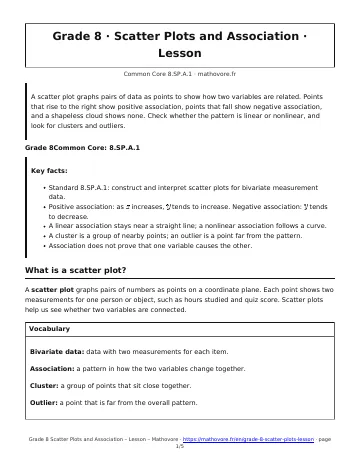
A scatter plot graphs pairs of data as points to show how two variables are related. Points that rise to the right show positive association, points that fall show negative association, and a shapeless cloud shows none. Check whether the pattern is linear or nonlinear, and look for clusters and outliers.
Grade 8 Scatter Plots Lesson: key facts
- Standard 8.SP.A.1: construct and interpret scatter plots for bivariate measurement data.
- Positive association: as \(x\) increases, \(y\) tends to increase. Negative association: \(y\) tends to decrease.
- A linear association stays near a straight line; a nonlinear association follows a curve.
- A cluster is a group of nearby points; an outlier is a point far from the pattern.
- Association does not prove that one variable causes the other.
What is a scatter plot?
A scatter plot graphs pairs of numbers as points on a coordinate plane. Each point shows two measurements for one person or object, such as hours studied and quiz score. Scatter plots help us see whether two variables are connected.
Bivariate data: data with two measurements for each item.
Association: a pattern in how the two variables change together.
Cluster: a group of points that sit close together.
Outlier: a point that is far from the overall pattern.
How do you tell positive, negative, or no association?
Look at the direction of the cloud of points from left to right.
| Pattern of points | Association | Example |
|---|---|---|
| Rise to the right | Positive | hours studied and quiz score |
| Fall to the right | Negative | temperature and cups of cocoa sold |
| No visible pattern | No association | shoe size and test score |
What is the difference between linear and nonlinear association?
If the points stay close to a straight line, the association is linear. If they follow a curve, such as a ball that goes up and then comes down, the association is nonlinear. A curve can rise and fall, so it is not always positive or negative.
What are clusters and outliers?
Look for groups and for points that do not fit. Two groups with a gap between them are clusters. A single point far from the others is an outlier, and it deserves a second look: it may be a mistake or a special case.
How do you build and describe a scatter plot?
- Choose a scale for each axis that covers all of the values.
- Plot each pair as one point.
- Describe the direction, the shape (linear or nonlinear), any clusters, and any outliers.
Worked example. The points \((1, 55)\), \((3, 72)\) and \((6, 92)\) in the first graph rise from left to right and stay near a line, so the plot shows a positive linear association. A strong pattern does not prove cause: studying probably helps, but association alone does not show it.
Scatter Plots and Association: frequently asked questions
What does a scatter plot show?
A scatter plot shows how two variables relate by plotting one point for each pair of values. For example, each point can show a student’s hours of practice and free throws made.
How can you tell if a scatter plot has a positive or negative association?
Read the points from left to right. If they generally go up, the association is positive. If they generally go down, it is negative. If they look like a random cloud, there is no association.
What is an outlier in a scatter plot?
An outlier is a point that lies far from the overall pattern of the other points. In a plot where players make more free throws with more practice, a point showing 7 hours and only 3 made shots would be an outlier.
What is the difference between a linear and a nonlinear association?
In a linear association the points stay close to a straight line. In a nonlinear association they follow a curve, like the height of a kicked ball over time.
Does a strong association mean one variable causes the other?
No. Two variables can move together because of a third factor. Ice cream sales and sunburns both rise on hot days, but ice cream does not cause sunburn.
How to use this grade 8 scatter plots lesson
Use this grade 8 scatter plots lesson before the worksheet, then check what you learned with the quiz.

See every chapter on the Grade 8 math page.